
Navigating the New QuickBooks Online Experience
If the updated QuickBooks Online layout has you clicking around trying to find what used to be obvious, you're not alone. The recent redesign introduced some of the biggest navigation changes the platform has seen. We're going to walk through what shifted and how to move through it without wasting time.
The update rolled out late last fall and significantly changed how users navigate the system. By now, you're likely able to complete your regular bookkeeping tasks. But that doesn't mean it feels intuitive yet. Even experienced QuickBooks users have had to slow down and reorient themselves. For many business owners, this is where having a structured bookkeeping process makes a difference.
The good news is that the underlying accounting functions haven't changed much. Your reports, transactions, and reconciliations still operate the same way. What's different is the pathway to get there. The dashboard looks different. The menus are reorganized. Familiar buttons have new names. Once you understand the new structure, it starts to make sense—but there is an adjustment period.
Let's start with the toolbar, since that's where most people notice the shift first.
The “New” button in the upper-left corner is now labeled “Create.” When you hover over it, you'll see a dropdown list of transactions you can initiate. You'll also find links for administrative tasks such as managing tasks or adding a contractor. Functionally, it's similar to before—the presentation is what changed.
Another helpful addition is the ability to bookmark specific pages. If there are reports or screens you access regularly, you can save them so you don't have to click through multiple layers each time. Use the Bookmarks icon in the toolbar to view saved pages, or bookmark certain pages directly while you're on them. Small efficiency gains add up.
Just below that is the Home icon, which takes you to the main dashboard. This page is information-heavy. Because there's so much happening in one place, it's easy to overlook tools or shortcuts that could be useful. Taking a few minutes to intentionally scroll through and understand what's available can save frustration later.
The Feed icon opens your Business Feed, which also appears at the top of the Home screen.
QuickBooks Online provides a personalized Business Feed that prompts you to take specific actions and provides insight.
Selecting the Reports icon opens the full library of QuickBooks Online's standard reports.
From there, you can run the built-in financial statements or customize reports to fit what you actually need to see. The reporting functionality itself hasn't changed much — it's just accessed differently.
If you hover over All apps in the toolbar, you'll see a directory of what QuickBooks now groups into “Apps.” The Customize icon allows you to rearrange those apps and pin the ones you use most often to the top. If you want a cleaner screen, you can also collapse the toolbar entirely by pressing Ctrl + period (.).
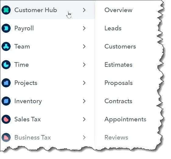
Apps are essentially the reorganized navigation structure. What used to live in a straightforward left-hand menu is now grouped into hubs. Each App contains related transactions, lists, and dashboards for a specific area of your business — such as Accounting, Time, or Projects. You may also hear them referred to as modules.
Some App shortcuts appear on the Home dashboard, but the complete list is easiest to access through the All apps menu in the toolbar.
QuickBooks has always provided multiple ways to accomplish the same task. That flexibility is still there. For some users, that's convenient. For others, especially after a layout change, it can feel like too many paths to the same destination.
In our experience, navigating through All apps is usually more efficient than relying on the Home screen shortcuts. The Home page often requires scrolling past widgets and updates to find what you're looking for. When you hover over All apps and select a hub, you get a clearer list of sub-pages — for example, a direct path to your customer list without extra dashboard distractions.
Keep in mind that each hub is structured a little differently. Some include quick-action buttons or shortcuts at the top of the page, while others are more list-driven. Once you identify the sections you use most, build a consistent navigation habit so you're not relearning the system every time you log in.
Hover over the All apps icon in the left vertical toolbar to see a list of task and content links for each App.
More Navigation Updates
If you've been wondering where certain links disappeared to — especially Integrations — look to the upper-right corner of your screen. Several tools that used to live in other areas have been consolidated there. You'll now find access to Tasks, Notifications, Settings, Help, and Integrations all grouped together in that top menu bar. When in doubt, check there first.
Getting Comfortable with the New Layout
By this point, you've likely figured out how to get to the screens you use most often. But knowing how to click through and knowing how to work efficiently aren't the same thing. The updated interface works best when you develop a consistent workflow and take advantage of the built-in tools designed to surface what needs attention.
One simple place to start is customizing your Home dashboard. Click Customize in the upper-right corner of the Home screen to manage the widgets that appear there. You can add or remove sections and drag them into an order that makes sense for how you operate. If something isn't helpful, remove it. If there's data you review regularly, move it to the top.
The goal isn't to look at more information. It's to see the right information quickly.
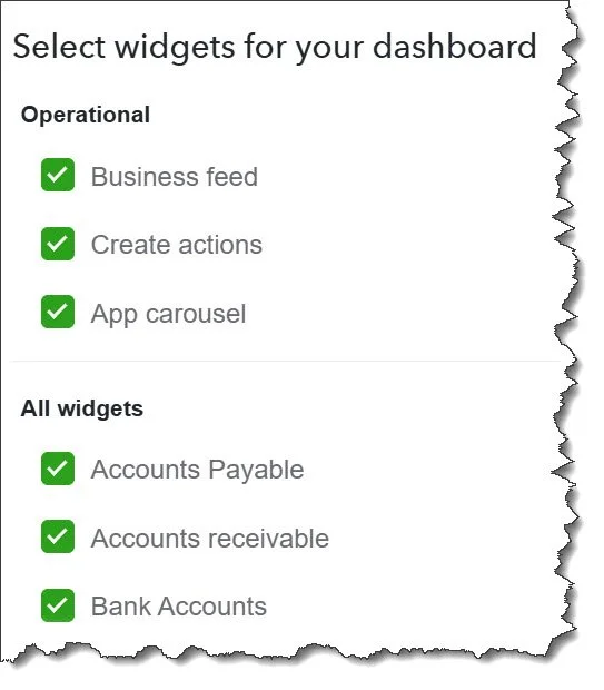
You can add or remove “widgets” on the Home page and rearrange them.
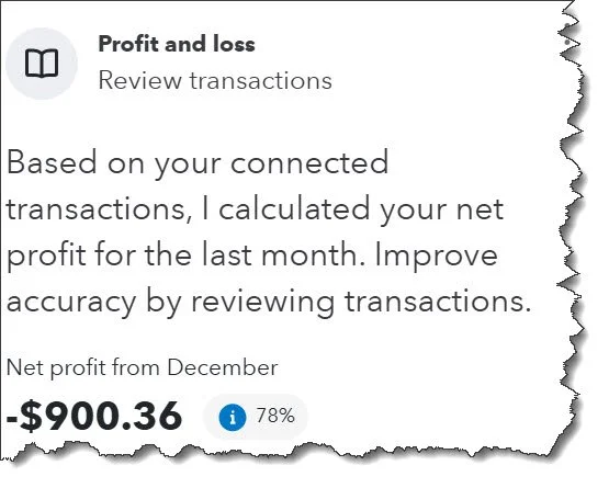
Use Insights within your reports. After you've adjusted a report to show what you want, select Insights to view feedback from the Accounting Agent. This feature highlights trends, fluctuations, or items that may deserve a second look. It's not a replacement for analysis, but it can help surface patterns you might otherwise miss.
Pay attention to AI suggestions in the bank feed. As you review transactions, QuickBooks may recommend categories or matches based on past activity. These suggestions can speed up processing, but they still require oversight. Automation is helpful. Blind automation is not.
Take advantage of keyboard shortcuts. With the navigation changes, shortcuts can save a noticeable amount of time. Press Ctrl + Alt + ? to see the full list and identify a few that fit your regular workflow.
If you previously relied on Tags, you'll now use Custom Fields instead. Access them through the gear icon in the upper-right corner under Lists. Custom Fields allow you to track additional data points in a more structured way.
And if you ever need to review account activity history, the audit log is still available — it's just less visible. From the Home screen, scroll to the bottom-right corner and select “See all activity.”
Interface updates can temporarily shake your confidence, especially when you rely on QuickBooks to run your business. The structure may look different, but the underlying accounting hasn't changed. If you're unsure about the new layout — or want to make sure you're using it effectively — we're here to help.